August 2019
This toolkit is your one-stop shop with everything you need to start creating as 80.lv. Take a look around, get to know us, play with our graphic elements and try our voice on for size.
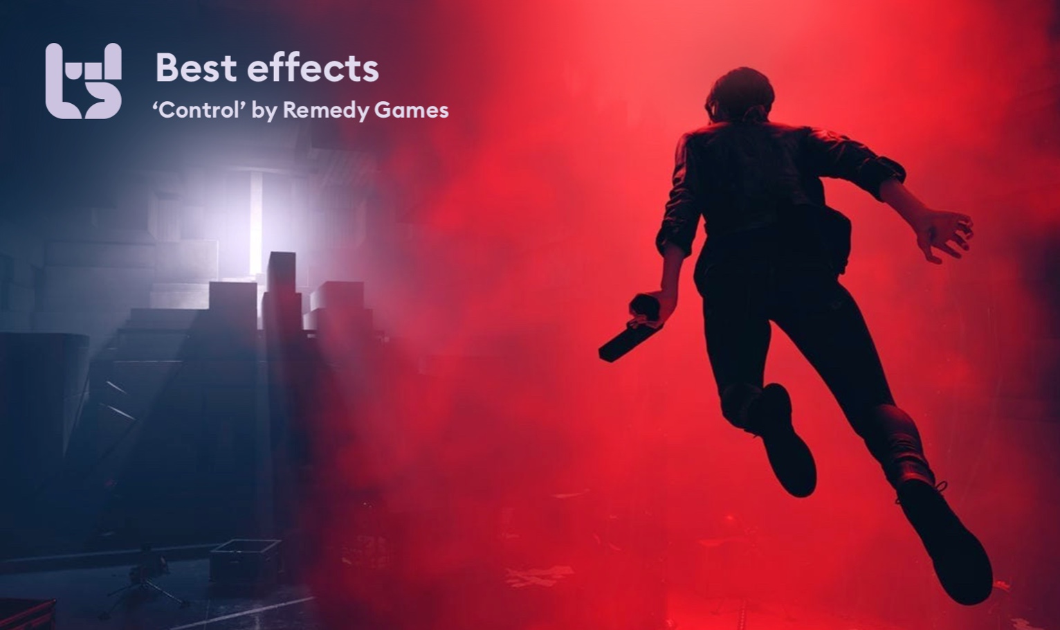
Creating a place for professional game developers
Gaming, computers, graphics universal way of communication.

And can't stop talking about
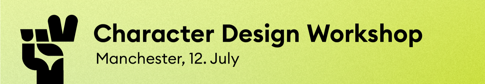
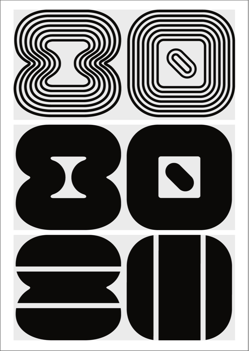
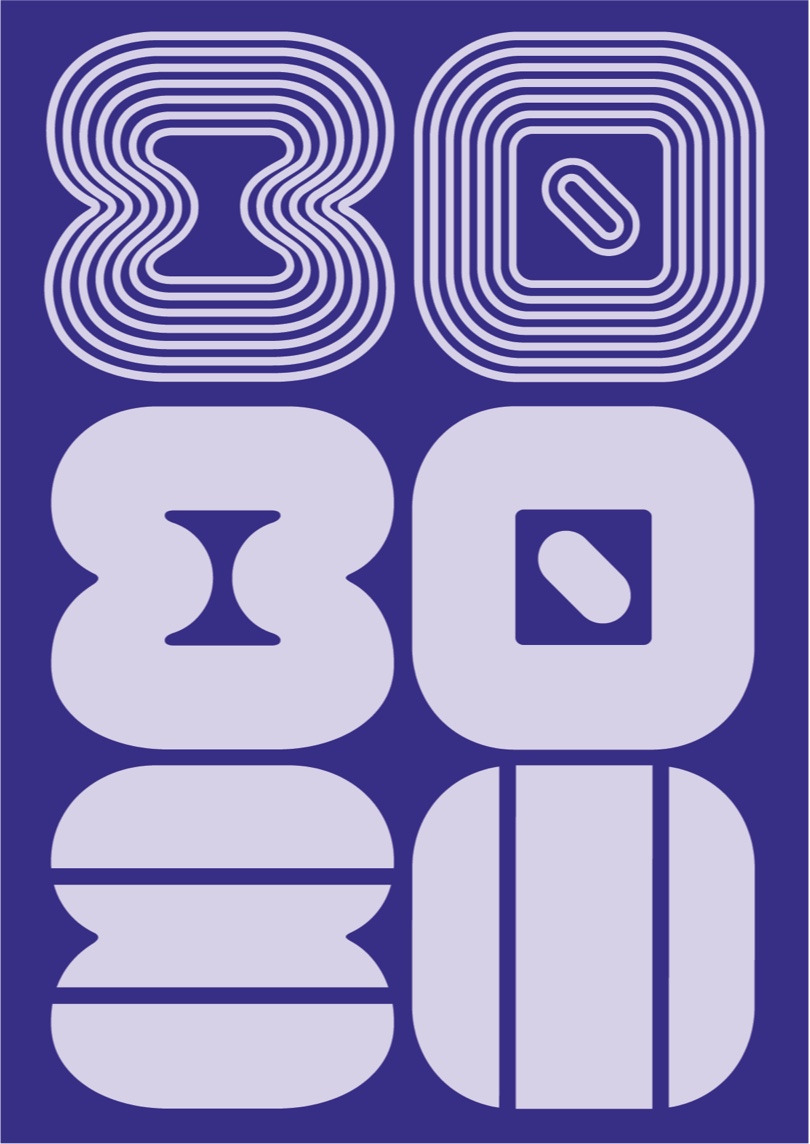
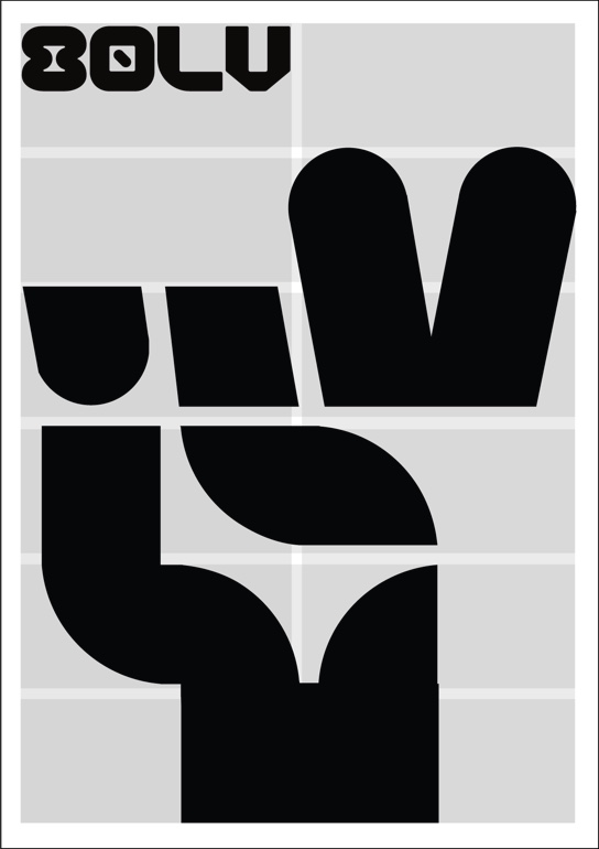
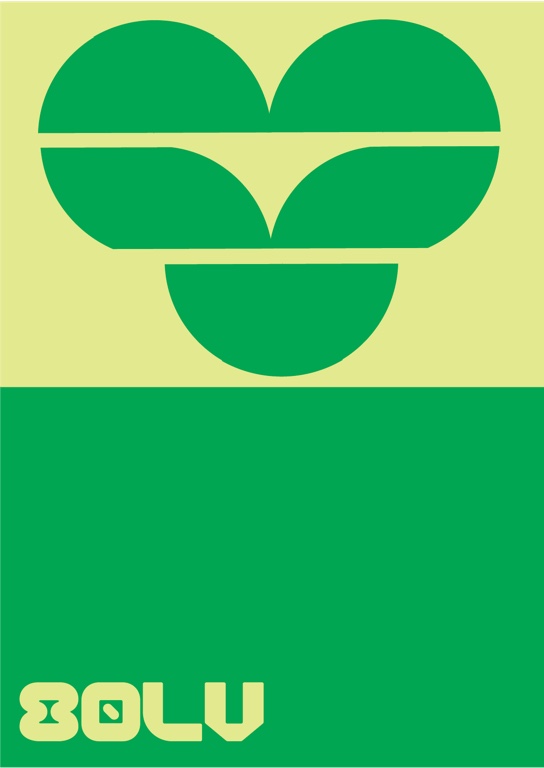
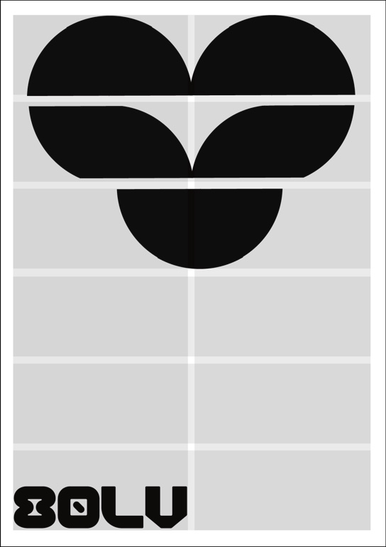
The 80lv logo is built from a series of geometrical shapes ― an homage to vintage games.
We created four stylistic logo vatiations, which can be used in different context.


Do not outline the logo
Do not rearrange the letters
Do not use multuple colors
Do not scale out of proportions
Do not drop shadow
Do not add inner shadow
Do not use gradients or effects
Do not feather the logo
Do not rotate
Do not use with other graphics
Do not place on a busy photo
Do not place on low contrast
primary font
Euclid Circular B is our primary font. It is a geometric font from the Euclid superfamily by Swiss Type Foundry consisting of several styles and variations. Its clear geometrical shapes produce a balanced and thoughtful effect, which works great in all kinds of media, printed matters and on-screen experiences.
Euclid Circular B Semibold
ABCDEFGHIJKLMNOPQRSTUVWXYZ
abcdefghijklmnopqrstuvwxyz
1234567890 !@#$%^&*()
Euclid Circular B
Regular
ABCDEFGHIJKLMNOPQRSTUVWXYZ
abcdefghijklmnopqrstuvwxyz
1234567890 !@#$%^&*()
primary font
Noticia Text is a contemporary humanist slab serif typeface designed to be used for running text on digital newspapers. We use this fontface only as a text body.
Noticia Text
Regular
ABCDEFGHIJKLMNOPQRSTUVWXYZ
abcdefghijklmnopqrstuvwxyz
1234567890 !@#$%^&*()
Noticia Text
Italic
ABCDEFGHIJKLMNOPQRSTUVWXYZ
abcdefghijklmnopqrstuvwxyz
1234567890 !@#$%^&*()
12 column grig

We never align objects in the center. It is recommended to align the logo and other important elements to the side, as it produces a more dynamic and dramatic effect.


∙ minimum font size: 8pt
∙ use the 4 or 6 column grid
∙ don’t use low contrast typography
∙ don’t use all capitals
∙ use colored paper


∙ align icons and logo into a grid
∙ use color contrasts
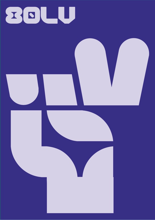
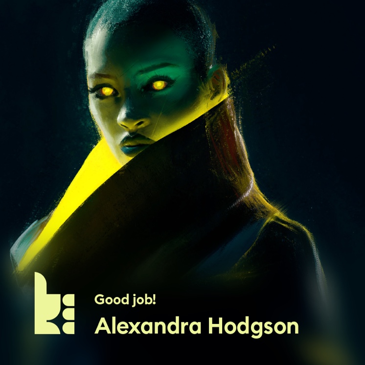
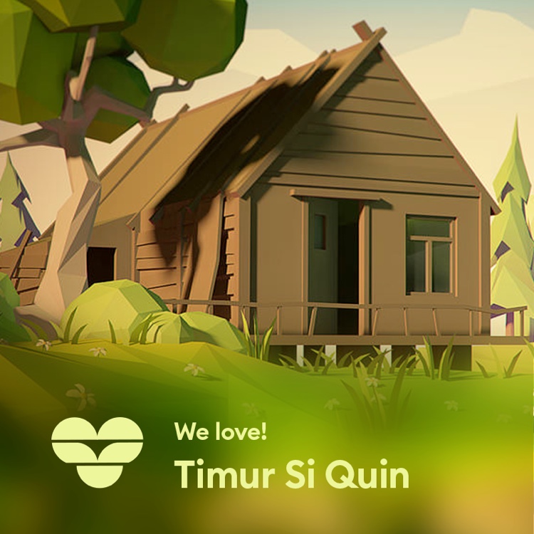
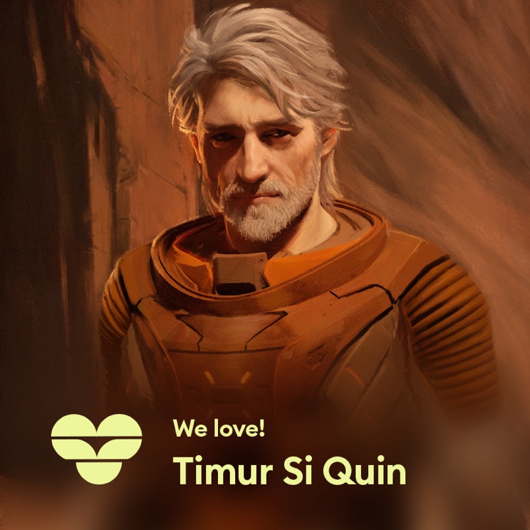
Icons can be combined together and form a composition.
It is important to try to express a message with
a bit of humour, stay minimal and clear.
And can't stop talking about

Explaning in 5 simple steps